Published
DSM
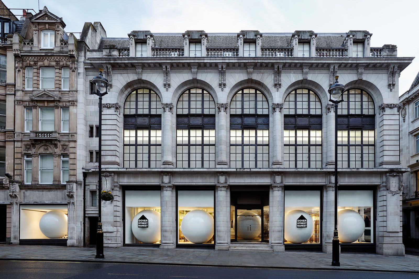
One of my favourite places in London is Dover Street Market (probably my No.1 favourite place to be honest). I have been going there for many years to soak up the vibe and gain immense inspiration from the store design/layout, clothing designs on display, people that go and work there and Rose bakery. The complete package makes it’s worth visiting with frequency because there is always something new to discover or gain creatively.
The DSM logo has come to represent this experience and memory I have of this place. When I look at their logo, I feel connected to my inspired self. Analysing the logo further;
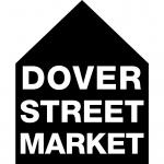
- The shape is a sort of primal drawing shape, representing a house. This simplicity creates a sort of open platform for the diverse selection of brands and styles within the store.
- A home which represents the family, which is very suited to their store concept; a group of brands together under one roof, some united by brand origin (Comme des Garçons) some related to it and yet others invited in as new friends.
- “Dover Street Market” as a form of an adres places it in a space and time, a location*. Variations of the logo add the city name underneath “Market” (NEW YORK, LONDON, GINZA).
- “Market” signifies a collection of sellers/retailers and a certain temporality to what’s on offer. It also brings up an image of a lively and communal atmosphere.
*Dover Street Market London, which was the first location of all DSM locations, was located originally on Dover Street in Mayfair, London. This is where its name originates from. Although the London store has since moved to Haymarket, its name is still linked to the first store location, rooting it in a place and linking it to a certain time.